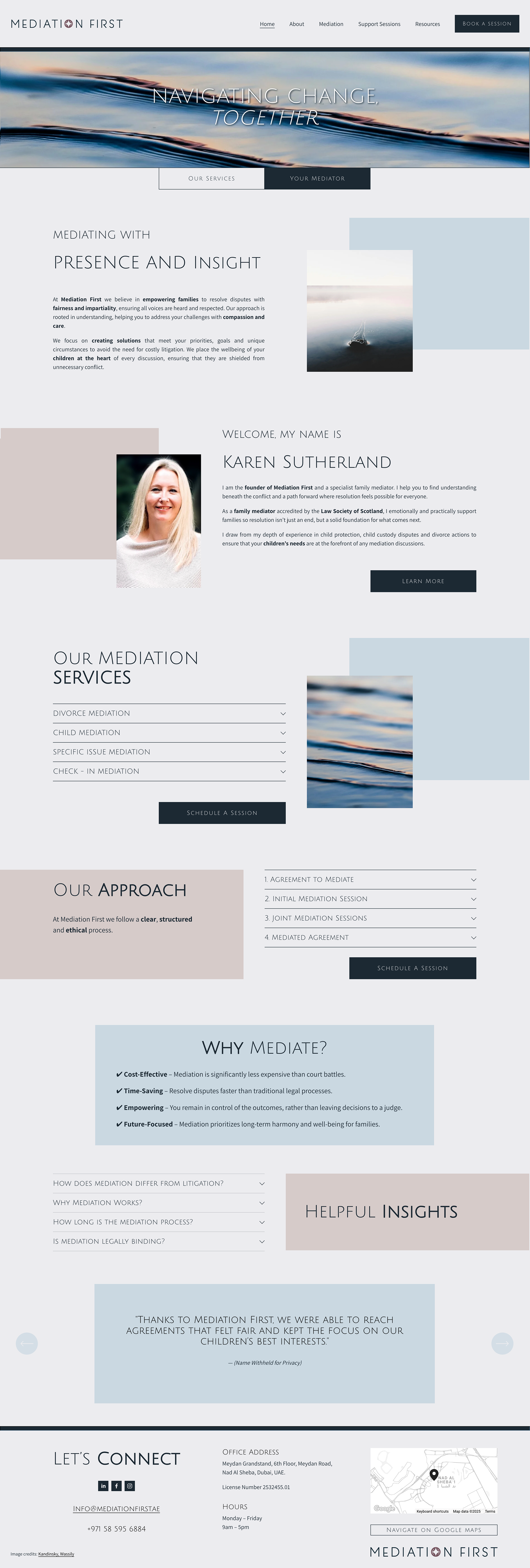
Logo & Website Design for Mediation First
Project Scope: Complete branding package, including logo and website design, for Mediation First, a boutique Dubai-based mediation firm (mediationfirst.ae).

1. Brand Essence & Challenge
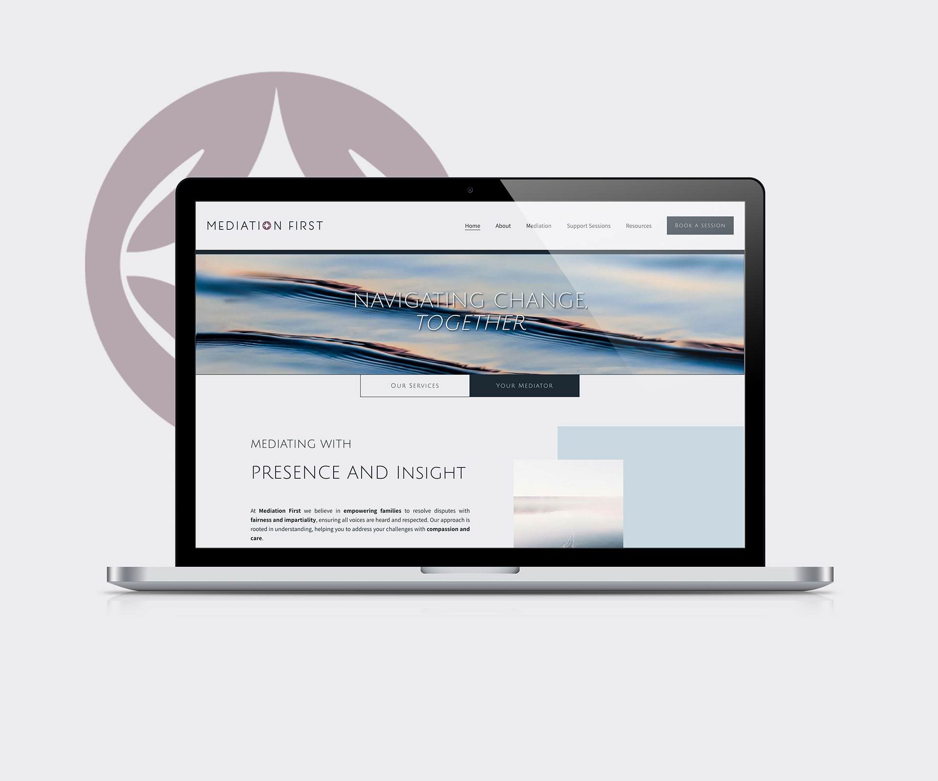
Mediation First, founded by specialist family mediator Karen Sutherland, offers compassionate, child-focused mediation services in Dubai. The brand needed a visual identity that reflected its values of empathy, clarity, and peaceful resolution—capturing both strength and serenity in the sometimes-heavy domain of family law Mediation First.
2. Logo Design
Crafted a minimalist, symbolic mark, using soft curves and a muted palette to evoke notions of calm, trust, and safe navigation through emotional terrain.
Typography blends warmth and professionalism—creating a harmonious balance between reassurance and competent authority, aligning with the firm’s ethos of guiding clients “together, with presence and insight” .
3. Website Design Highlights
Mood & Imagery: Dominated by imagery of tranquil water ripples and soft gradients, setting a tone of reflection and clarity—symbolic of mediation’s gentle yet profound impact .
Content Structure: Clear, empathetic messaging—like "Navigating Change, Together"—guides users through services such as divorce, child, and issue-specific mediation, highlighting accessible simplicity and support .
User Experience: Streamlined booking interface offering a complimentary 15-minute discovery call, plus flexible in-person or virtual mediation options. This approach reflects Mediation First’s client-centered service model Mediation First.
4. Outcome & Impact
Emotional Connection: Visuals and tone collectively reassure clients during stressful times, positioning the firm as a trustworthy partner.
Brand Cohesion: The union of visual identity and UX delivers an intuitive, calming journey from first site visit to booking a session.
Professional Presence: The branding exudes modern elegance with sensitive undertones—perfect for a mediation practice focusing on clarity, compassion, and empowerment.
Summary at a Glance
Logo - Soft, symbolic, balanced—communicates trust and calm
Imagery & Tone - Water visuals, muted palette—evokes peace and reflection
Typography - Professional yet gentle—invites, doesn’t intimidate
UX & Messaging - Simplified booking, empathetic language—supports users
Result - A cohesive brand experience that fosters trust and clarity