Branding & Web Design for Synertronic Designs
Project Scope: Logo identity and landing page design refresh for Synertronic Designs, a Stellenbosch-based electronics design and engineering firm.
1. Brand Context & Objective
Synertronic Designs has a deep heritage in creating specialised power supplies, magnetic components, and data acquisition systems for scientific and industrial applications. Based in Stellenbosch, South Africa, the company blends expertise in electronics, software, and analog/digital systems.
The refreshed branding aimed to update the visual identity to reflect their technical sophistication and modern innovation, while enhancing clarity and credibility on the landing page.
The refreshed branding aimed to update the visual identity to reflect their technical sophistication and modern innovation, while enhancing clarity and credibility on the landing page.
2. Logo & Visual Identity
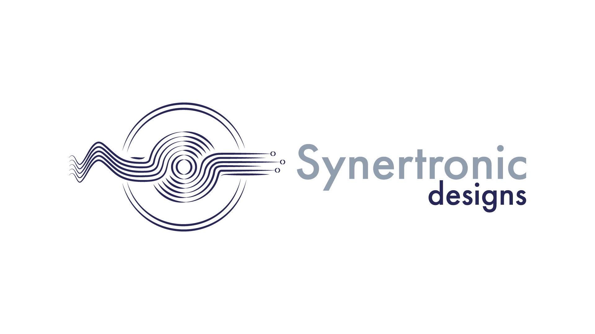
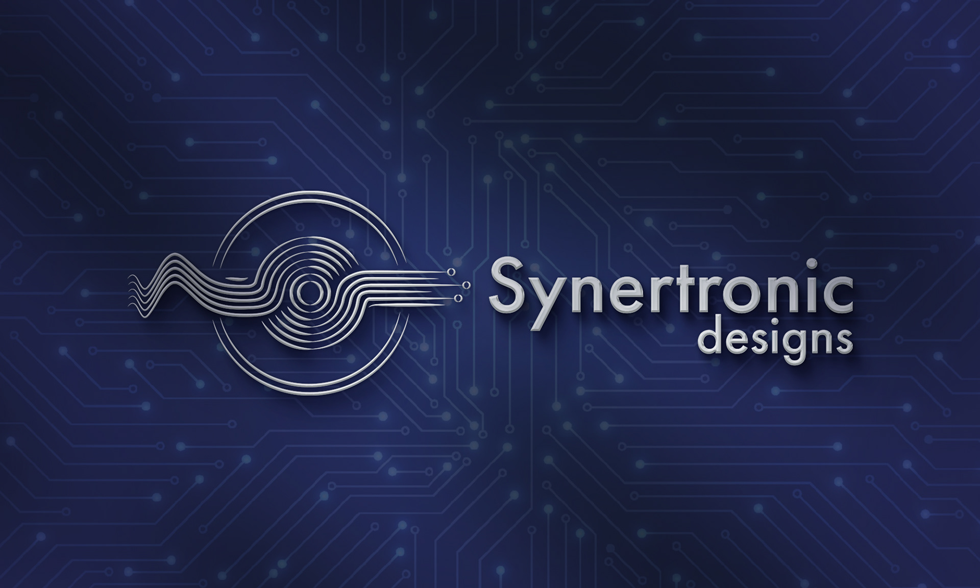
Developed a clean, geometric logo that conveys precision and technological reliability—drawing inspiration from circuit motifs and electromagnetic forms.
Utilised a muted, industrial-neutral palette (charcoal grays, steel tones) with support colors that nod to electrical signal flows, balancing technical strength with approachability.
Integrated sleek, technical typography to anchor brand messaging with clarity and a professional tone.
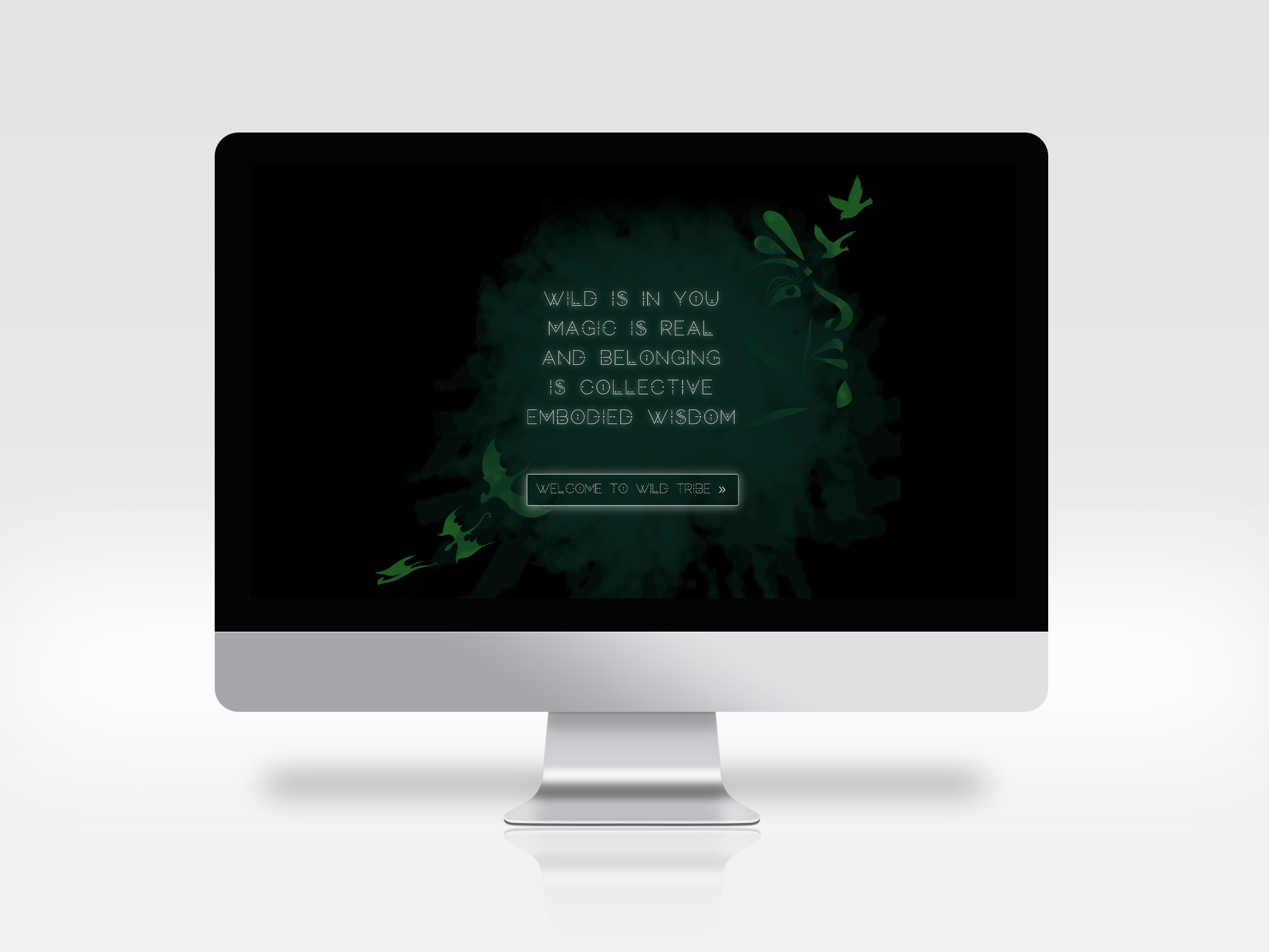
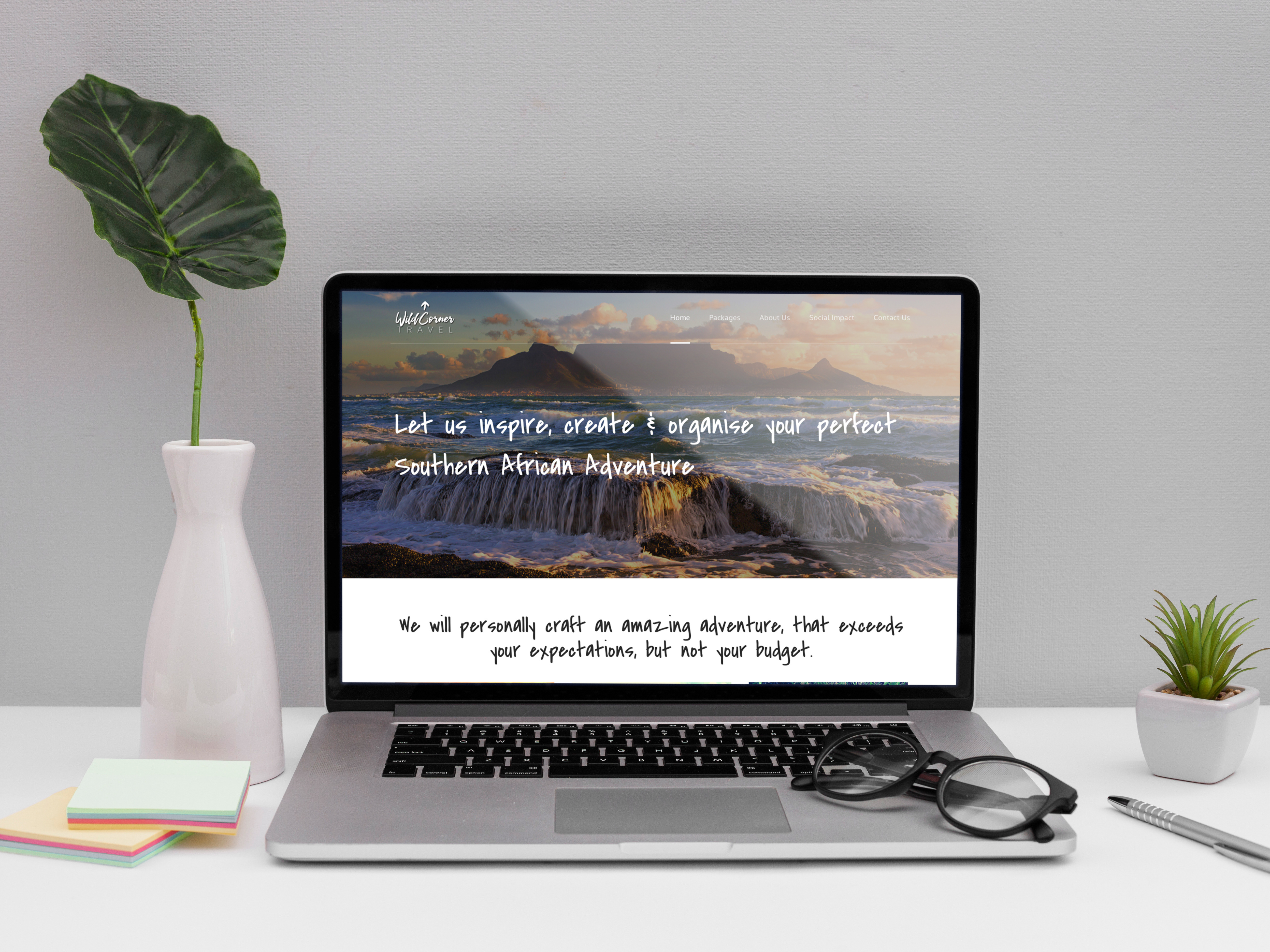
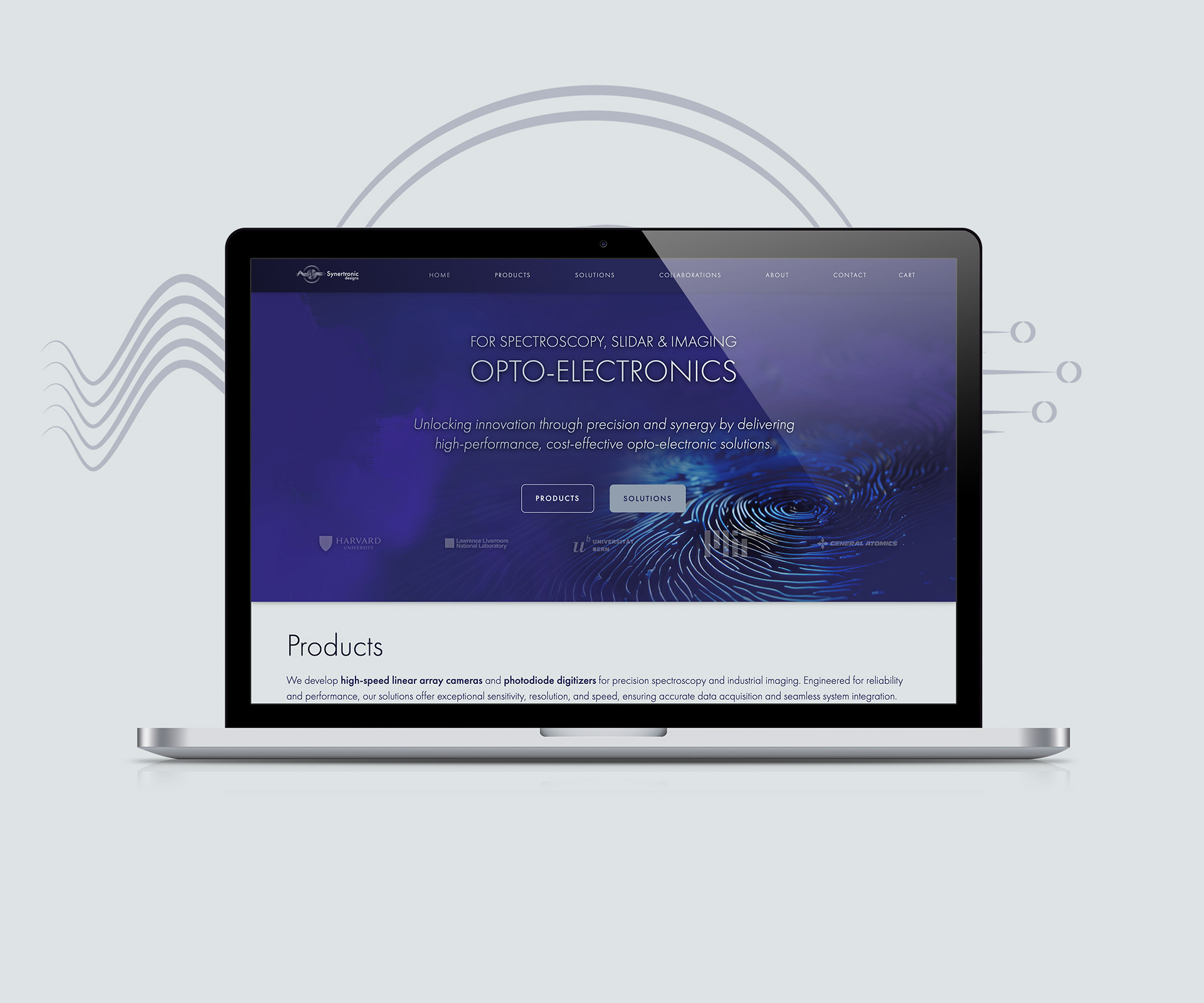
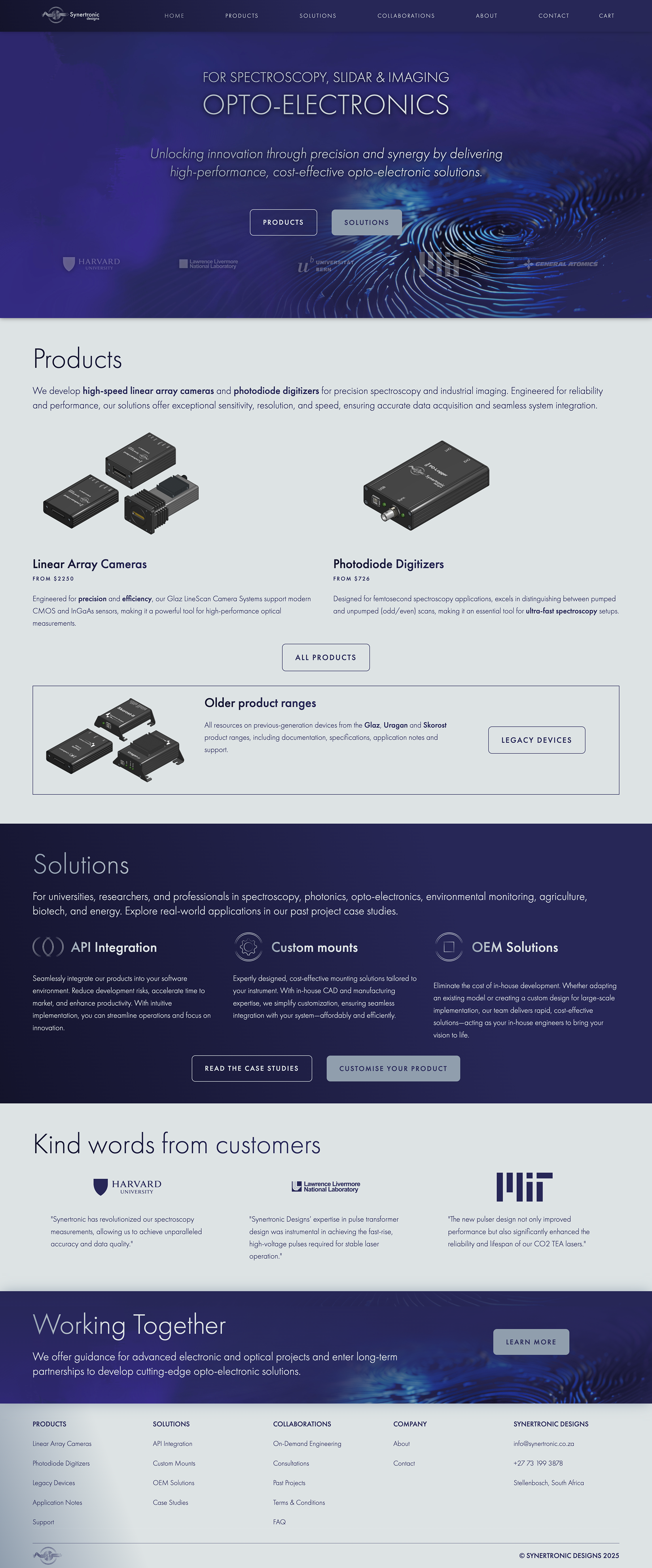
3. Landing Page Design Highlights
Hero Section: A compelling introduction that communicates Synertronic’s core strengths in electronics innovation, offering reassurance and professionalism from the first glance.
Product & Services Display: Streamlined categories—such as power supplies, data acquisition, and product development—each with intuitive icons and clear navigation, enhancing usability.
Technical Storytelling: Engaging yet accessible copy emphasizes customisation, R&D leadership, and engineering excellence—reinforcing trust and expertise.
Contact & Location: Clear presentation of their Stellenbosch base supports local credibility and accessibility.
4. Impact & Future-proofing
Aligned Brand Perception: The new identity bridges Synertronic’s advanced technical capabilities with a contemporary, approachable aesthetic.
User-Centric Navigation: Simplified page layout helps technical and non-technical stakeholders quickly understand offerings and expertise.
Scalable Cohesion: The refreshed brand elements translate seamlessly to the upcoming synertronic.co.za site, enabling consistent storytelling across platforms.
Summary Overview
Logo & Palette - Precision and professionalism rooted in tech aesthetics
Typography - Clear, modern, and confidently technical
Page Layout - Organized product categories & intuitive navigation
Tone & Messaging - Trust-building through clarity and domain authority
Brand Cohesion - Flexible assets for future site migration and growth
The Symbol
Precision, synergy, and cutting-edge technology.
Company’s name refers to Synergy of 3 elements, client, supplier and relationship. The values and concepts that are important are: precision, integrity, definition, symmetry, digital, simple, electronics., excellence and innovation.
- Waveforms & Spectroscopy Patterns – representing precision measurement, data processing, imaging, and electronic signal analysis.
- Geometric Optical Designs – shape inspired by lenses and refraction to symbolize imaging and digital precision.
- Minimalist Circuitry – abstract representation of circuit pathways to emphasize connectivity, electronics, and digital synergy.
- Fractal Symmetry & Disruptive Patterns – represent innovation and high-tech synergy.
- Interference Patterns - used in spectroscopy and wave optics, these convey light-based measurement, accuracy, and technical sophistication.
- Moire Patterns - represent precision, digital resolution, and layered synergy in imaging and measurement fields.
Typeface & colour palette
Typeface - Futura PT Efficiency and forwardness.
Modern | Versatile | Readable | Breathable | Clean | Industrial | Timeless | Balance of Classic/Modern | Consistent | Reliable
Pewter - Versatile light bluish-gray with a serious, industrial feel.
HEX: #909EAE | RGB: 144,158,174 | CMYK: 17, 9, 0, 32
Pewter, with its cool undertones and hint of blue, typically conveys a serious and sophisticated air. Its depth and subtle elegance symbolize practicality, sincerity, and intellect. In color psychology, it is calming and can evoke feelings of stability and reliability. It promotes focus and can help reduce the perception of chaos in an environment, making it conducive to thoughtful and introspective moods.
Midnight Blue - Deep, dark shade that evokes sophistication and tranquility.
HEX: #272757 | RGB: 39,39,87 | CMYK: 55, 55, 0, 66
Evokes mystery and contemplation, bridging the gap between traditional blue's calmness and black's authoritative strength. Invites deeper thought and sparks curiosity. In color psychology, enhances reliability and trustworthiness. It commands respect and fosters a calm, reflective thought, making it ideal for environments that encourage focus and peace. Communicates values of confidence, serenity, and depth.
Secondary Color: Platinum
HEX: #DDE3E4 | RGB: 221, 227, 228 | CMYK: 3.1, 0.4, 0, 10.6
This soft, desaturated light gray serves as a gentle alternative to pure white (#FFFFFF) when used on dark backgrounds, such as Midnight Blue (#272757). It reduces harsh contrast, improving visual comfort and readability while maintaining sufficient distinction for legibility.